Adopting Shopify Polaris Design - 6 Reasons and 6 Do's
We have applied Shopify Polaris Design to our admin portal, following Shopify's announcement at Unite 2018. It is not an easy decision especially it means you need to replace your whole UI component library (if there is one). In this blog we will share why we choose Shopify Polaris over other libraries or building our own library, and also tips of applying Shopify Polaris to your current design.
And of course - big thanks to the Shopfiy Polaris team for this awesome work 🤘
6 Reasons of choosing Shopify Polaris
👍UI/UX designed for B2B admin portal
👍Frequent updates and maintenance
👍Clear detailed documentations for designers, content writers and engineers
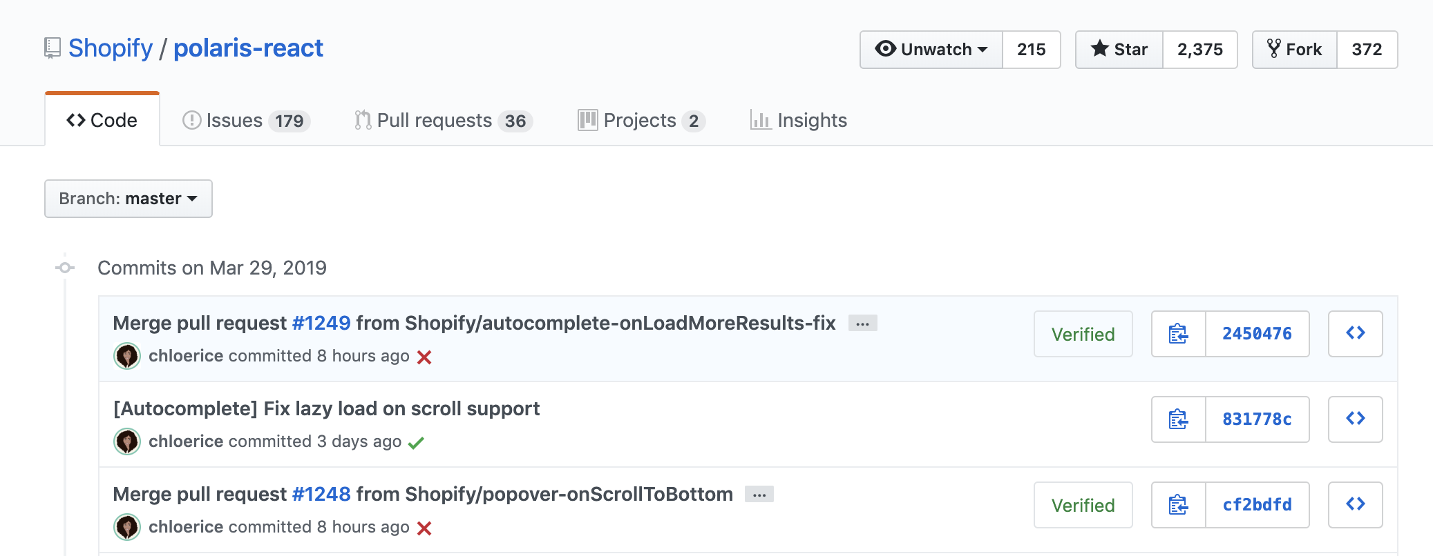
👍Fasten and improve quality of frontend development
⭐️Keep your brand identity
⭐️Work with other eCommerce platforms
AfterShip tracking app has been with Shopify app store since 2012, and has been one of the top apps in the customer experience / support category. When Shopify announced about Shopify Polaris component library, our team immediately thought about its possibility of applying to all our products.
Clear direction
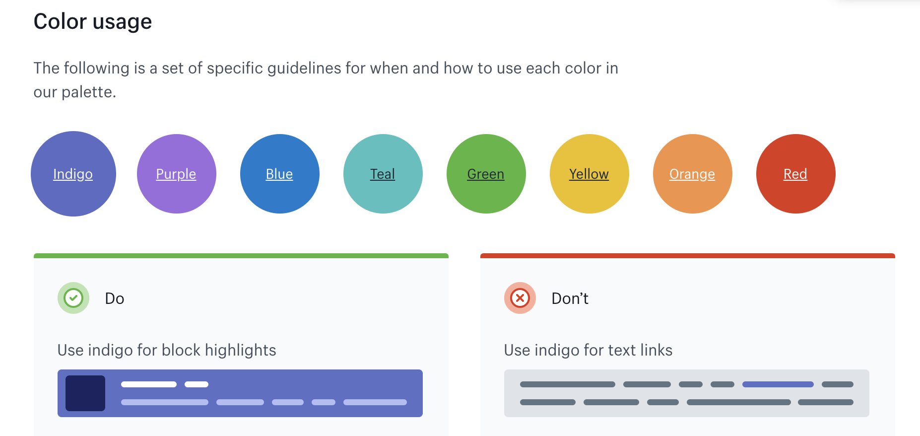
Shopify Polaris provides simple and detailed design guidelines on how you should use colour (e.g. button colour) and even how you write the contents. Rather than seeing them as restrictions, we treat them as clear directions of how we should design.
Many UI component libraries in the market do NOT give clear instructions and design guidelines. While at the first site, using an external UI library can make your design look beautiful and consistent. However, if the library is not clear and have too many components, your design can go off easily (e.g. padding and contents). The key of a libarary is that your team can have a consistent way to design and apply the standard. When a component is updated, you want to apply to all your previous design.
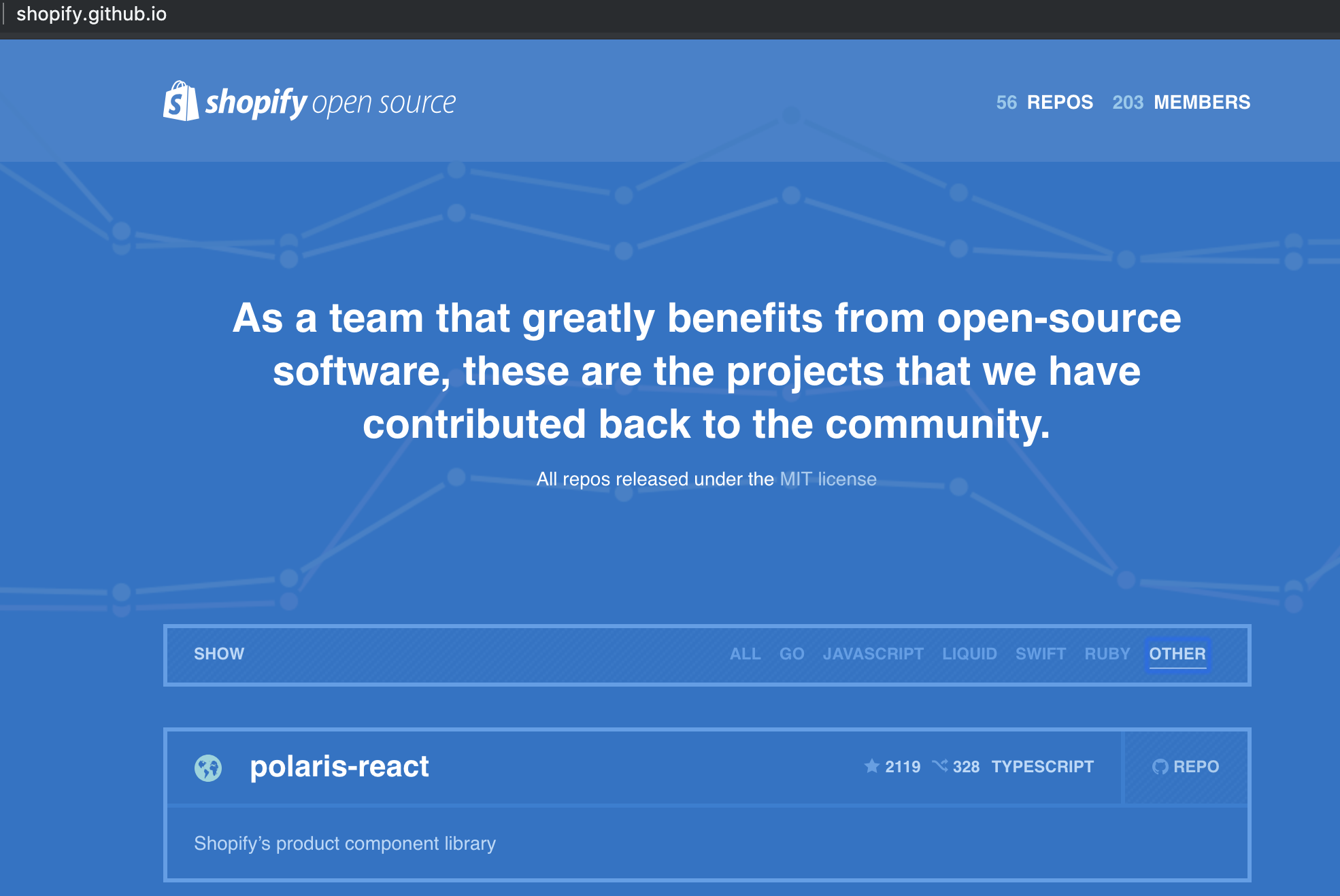
Shopify Polaris as an open source project
Shopify team states Polaris is one of Shopify's open source projects, which gives us confidence that we can apply this to our products that also works with other platforms (i.e. not limited to shopify).
Even Shopify Polaris has many great things, you can also go wrong when your team applies Shopify Polaris to your design and frontend development.
Your brand identify
While definitely you cannot control all the design elements, you can boost your brand identify by:
-
Adding a logo to the navigation bar
I probably don't need to tell you this but that's the key thing users will notice when it comes to brand for an admin portal). -
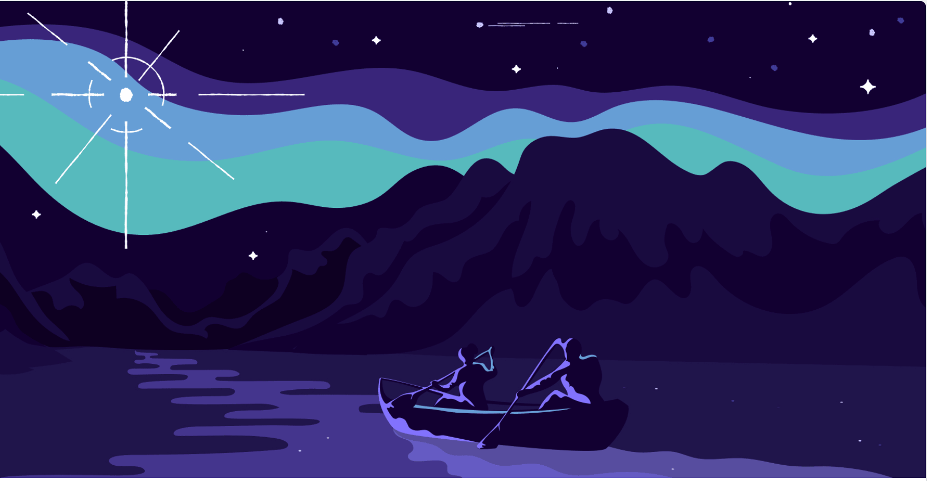
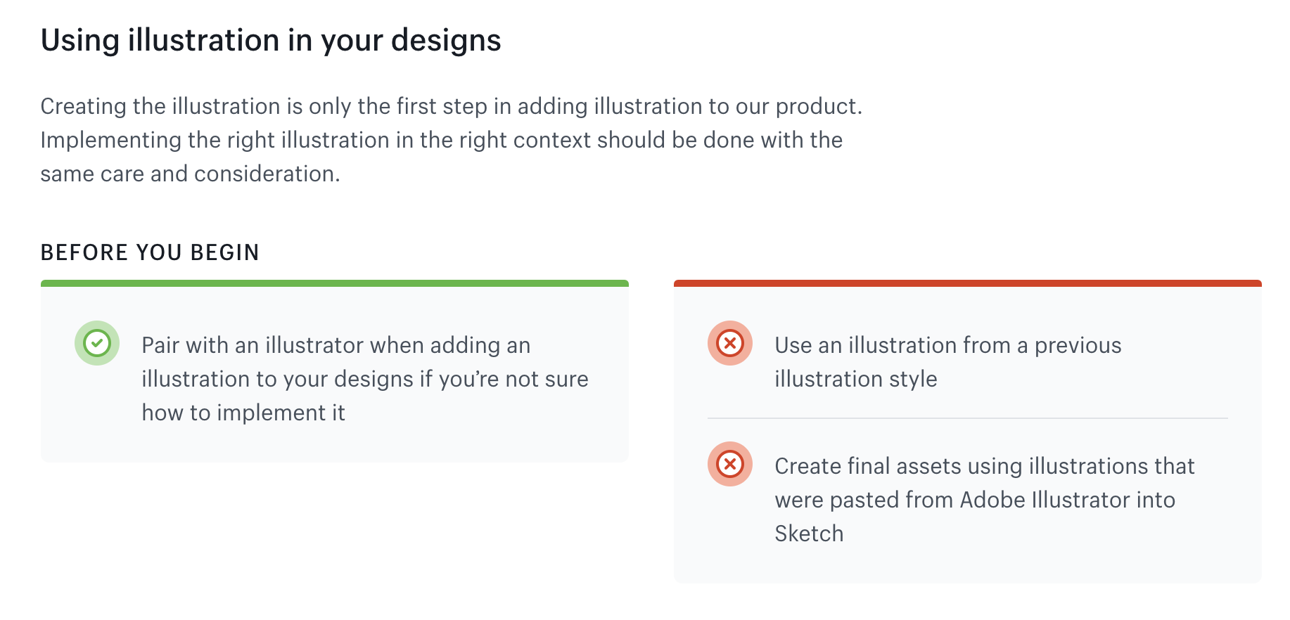
Design your illustrations
While you can add some illustrations in your admin portal, do bear in mind you need to follow Polaris style. -
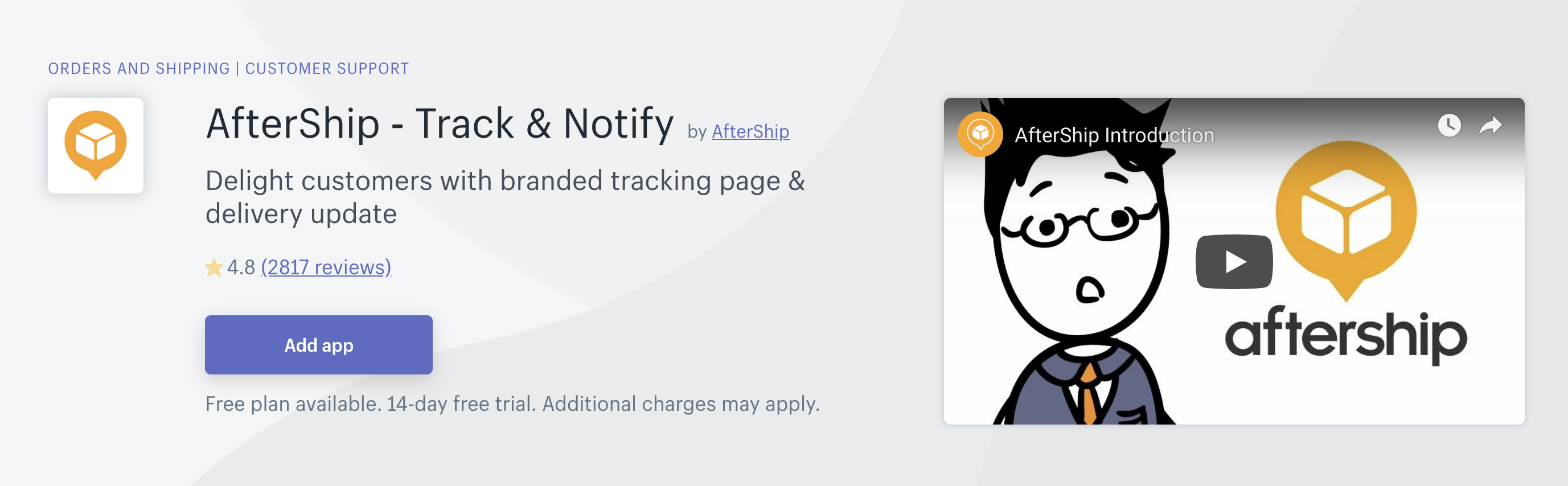
Focus on features and UX (e.g. www.aftership.com)
If you're in the B2B SaaS services, the key things users remember your brand is not because of the UI, it is more the feature set, pricing and UX (how easy to use). Put resources to really deliver the key values to users to make your brand recognizable.
The 6 Do's
✅Read documentations
✅Use Polaris component strictly
✅Subscribe to the latest updates
✅Use Polaris's Sketch files
✅Submit bugs and tickets
✅Design your illustrations / add your design
The one that is worth mentioning is to use Polaris component strictly. Most likely your designers are creative, they find it restricted to follow Polaris fully. Your designers then start to create new elements, say a dropdown or a table. Creating new elements may benefit in short term but harm the product in long run.
Don't (easily) create a new component on your own
-
Shopify team updates frequently
Your design will be hard to apply the latest updates at one point as there are too many custom elements. -
You thought your design is good but is actually bad 😏
Shopify has a strong UI/UX design behind Polaris to develop the library. If you do not agree with their design, raise the ticket and also try to understand their design perspective before really designing your own elements. -
The component already exists or will be available
Do check carefully the existing components and also the future components that the team plans to launch. Wait for the new updates if possible rather than developing your own component. And submit a ticket if you find a component missing that is very important.